Hashrate Index Q4 map puts US mining share at 35.6% and Oman ahead of UAE
Source report: 2026-10-05 · Editorial analysis published: 2026-10-07
The October 5 geographic update estimates country-level Bitcoin hashrate. Its map describes physical mining locations, not ownership, pool control or a live census.
Analysis and practical implications
This section is our analysis and illustrative calculations, separate from the source report.
A new map with an important measurement boundary
Hashrate Index published its fourth-quarter geographic update on October 5. Its leading estimates are the United States at 35.6%, Russia at 18.1% and China at 11.7%. Oman moves ahead of the United Arab Emirates. The figures concern estimated locations of Bitcoin computing work. They should be read with the report’s date and scope, rather than presented as a live count of every miner. A country label does not disclose who owns the equipment or chooses the pool to which it submits work.
Our analysis separates three questions that are often mixed in mining headlines: where electricity is consumed, who controls the business and which pool constructs candidate blocks. The same fleet can have different answers to all three. A geographic ranking helps explain exposure to local infrastructure and operating conditions; it cannot, on its own, establish the distribution of pool decision-making. Keeping that boundary visible is especially useful when a chart is copied into a procurement presentation or an argument about network decentralization.

A quarterly edition is not a launch announcement
The Q4 label identifies the edition of the report. It does not mean every listed machine was commissioned in October, and it does not provide a model-by-model sales register. A farm relocation, the curtailment of older equipment and a change in operating time can affect estimated regional work without a new ASIC launch. Our reading is that this is a report about the distribution of an operating activity. It belongs beside capacity utilization and energy analysis, rather than being used as evidence for a new hardware specification.
For catalogue maintenance, a manufacturer’s model documentation remains the appropriate starting point. A country’s rising share cannot establish a device’s algorithm, hash rate, power consumption or release year. Those details require separate evidence. Similarly, a regional decline does not mean all machines in that country became unprofitable. Local contract terms and equipment efficiency differ. The useful editorial distinction is between a reported aggregate movement and an explanation for an individual site, where power invoices and accepted pool work provide a different level of detail.
Percentages and percentage points answer different questions
A share change is easiest to understand when the units remain explicit. In an illustrative example, moving from 20% to 18% is a decline of two percentage points, but a 10% relative reduction in the original share. Those are both valid calculations and describe different things. Our analysis does not substitute the example for the report’s measured values. It shows why the phrase “down two percent” can be misleading if a reader cannot tell whether the writer means relative change or a change in the network share.
Absolute computing work adds another denominator. A region can increase its own hash rate and still lose share if the rest of the network expands more quickly. Conversely, its share can rise while its own activity falls if other regions fall further. This is why an operating review should retain the local estimate, the network estimate and the time window together. Converting a percentage headline directly into a hardware purchase target leaves out those relationships and can suggest expansion where the underlying measure actually describes a redistribution of work.
Location does not determine an individual electricity bill
A country ranking offers a useful starting point for research, but it is not a tariff quotation. Two operators in the same country can face different energy charges, demand charges, taxes, interruption rules and connection costs. A published national mining share does not identify the bill for a new site. Our assessment is that a location shortlist should move from the broad geographic picture to the specific utility agreement and facility design before a buyer compares expected operating costs or claims that one market is universally cheaper.
A practical comparison also separates purchased electricity from power measured at the ASIC input. Cooling, distribution losses and auxiliary equipment can sit outside the device’s published consumption. If a hypothetical farm’s ASICs draw 1 MW and its auxiliaries draw another 0.1 MW, the site draws 1.1 MW before any other losses. This is an independent example, not a specification for a location in the report. Matching the scope of the energy invoice with the scope of the performance measurement prevents a misleading efficiency comparison between two otherwise similar fleets.
Hashing hours matter alongside installed machines
Installed capacity and continuously operating capacity should remain distinct. A hypothetical 100-unit fleet running for twelve hours does half as much time-integrated work as the same fleet running at an unchanged rate for twenty-four hours. It still contains 100 machines. This simple example illustrates why a geographic view of realized work should not be treated as a photograph of installed inventory. Curtailment, maintenance and site commissioning can change the relationship between the machines physically present and the work actually contributed during an observation window.
For an operator, the relevant comparison is useful accepted work over a defined period, with interruptions and rejected shares recorded separately. Nameplate rates help plan an installation, but they do not establish the realized contribution when devices are offline or running reduced-power modes. Our analysis is that the geographic update should prompt questions about operating conditions, rather than a conclusion that every aggregate change is a shipment change. This distinction also helps compare regional statistics with monthly public-company reports that use different definitions of installed and operating hash rate.
Country estimates cannot reveal pool concentration by themselves
A miner can direct work to an endpoint outside the country in which its equipment operates. Changing that endpoint can alter pool attribution without moving any equipment or electrical load. Our interpretation is that the geographic distribution and the distribution of pool shares are complementary views. Neither should be silently substituted for the other. A location chart is most useful for studying infrastructure exposure, while pool attribution helps study the organizations coordinating block production under the particular protocol and configuration being used.
The same caution applies to ownership. A multinational company can operate in several jurisdictions, while a hosting campus can contain equipment belonging to many independent customers. Physical concentration at a site does not automatically identify a single beneficial owner. Our coverage therefore avoids turning the leading country shares into a count of firms or an assertion that national governments control the corresponding machines. Those are separate claims requiring ownership records, operating agreements and evidence about the actual decisions made by each party.
A site shortlist needs evidence at the circuit and contract level
The next step after comparing regions is to verify the particular site’s usable capacity, energization schedule and allocation to the proposed fleet. A large substation nearby does not guarantee that a customer has a reserved connection. A signed connection agreement also does not prove that every distribution component is ready. Our analysis treats the geographic ranking as a reason to investigate a market, with circuit capacity, permits and contract milestones deciding whether a particular mining deployment can proceed on the expected schedule.
Equipment planning should include voltage, cooling design, service access and the ability to maintain stable operation through local conditions. An inexpensive energy headline cannot compensate for an incompatible cooling loop or unavailable replacement parts. These are general procurement considerations, not new facts attributed to the geographic report. Combining them with device-level documentation makes the country comparison more actionable: the reader moves from where mining activity is estimated to occur to what their own machines would need in order to operate reliably at a specific address.
What readers can use and what remains uncertain
The report offers a dated comparative view of mining geography. Its estimates are useful for following changes in the network’s physical footprint, while their uncertainty should remain visible whenever the values are quoted. We have not converted them into an exact live inventory, an investment return or a recommendation to move a farm. The original source is linked so readers can inspect its full geographic discussion and compare later editions using the same definitions rather than combine incompatible figures from unrelated dashboards.
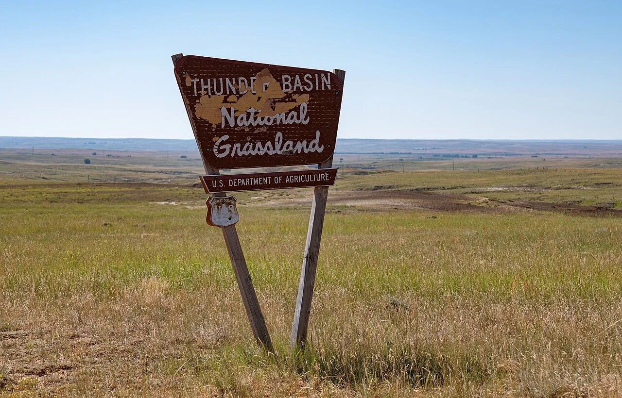
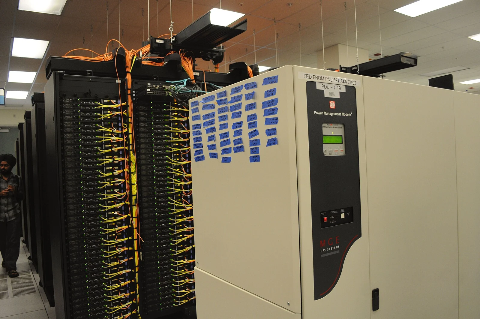
For ASIC.tools readers, the practical conclusion is to keep location, ownership, pool affiliation and operating performance in separate fields. The map helps ask where infrastructure pressures may matter. Actual site documents and measured fleet results answer what those pressures mean for a particular operator. Future reports can show whether the estimated distribution changes again; they cannot replace commissioning records or a model’s technical manual. This article preserves that distinction and uses contextual archival images rather than photographs presented as evidence of the surveyed farms.
Source: Hashrate Index ↗
Mining calculator ↗