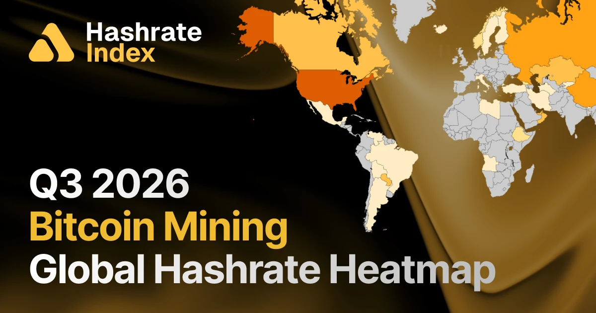
The global mining map shifts again
Source report: 2026-07-16 · Editorial analysis published: 2026-09-10
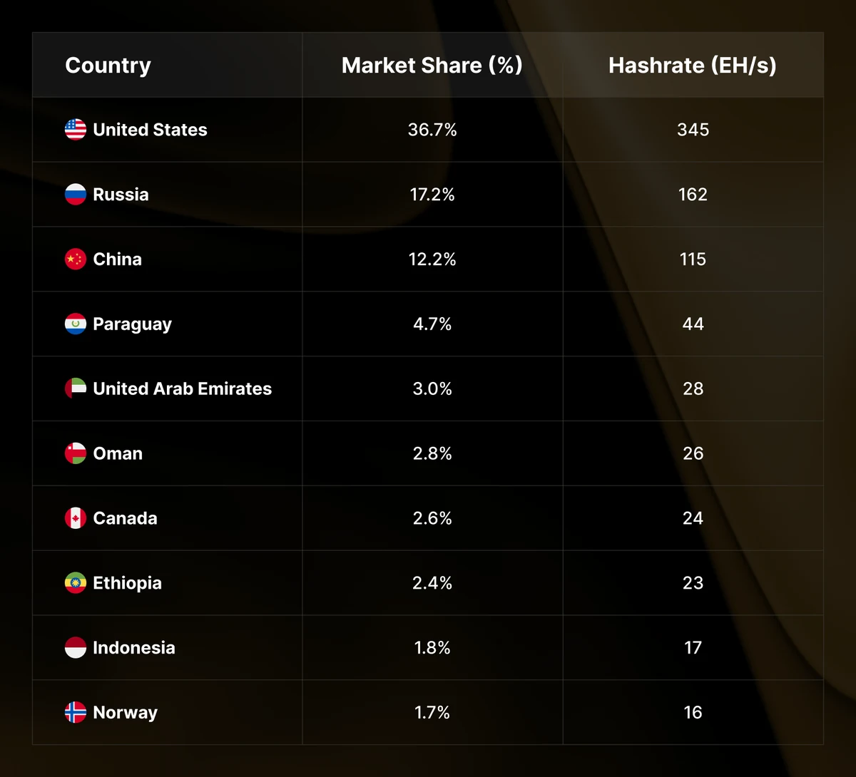
The Q3 heatmap tracks estimated country shares. Mining margins and investment moving toward AI both influence geographic redistribution.
Analysis and practical implications
This section is our analysis and illustrative calculations, separate from the source report.
A mining map is an estimate with a method
A global hashrate map makes a distributed industry easier to discuss, but its country shares are estimates rather than a physical census of every machine. The method, observation period and available data determine what the map can reasonably show.
When comparing two editions, check whether the methodology or coverage changed. A movement in a reported share can reflect a change in estimated capacity, a change in the total network or an improvement in the underlying information. The chart alone may not distinguish those explanations.
Share and absolute capacity can move differently
Suppose a country contributes 10 units of work to a network of 100, giving it a 10% share. If its contribution rises to 12 while the network rises to 150, its share falls to 8% despite growth in absolute capacity. This simple example explains why percentage rankings should be read alongside absolute estimates.
The reverse can also happen: a country can gain share while its own contribution is unchanged if other regions contract. For a site operator, the absolute capacity, the operating conditions and the reasons behind changes are more useful than treating a ranking as a direct measure of commercial opportunity.
Capital allocation can change the map gradually
An operator deciding between additional mining capacity and another computing use may change equipment orders long before the effect appears in operating hashrate. Existing machines, contracts and construction schedules create delays between a commercial decision and the measured network result.
That lag limits simple narratives. A geographic shift may combine equipment replacement, electricity economics, weather-related operating decisions and new projects entering service. A useful analysis identifies several plausible drivers and distinguishes reported evidence from interpretation.
Use geography to investigate operational exposure
For a fleet with sites in several regions, a map can prompt questions about concentration: dependence on one electricity market, one logistics route or one maintenance provider. Geographic diversification has costs as well as possible benefits, so the comparison should include management and service complexity.
The practical output is a clearer description of where the operation depends on shared conditions. A global chart can help frame that review, but it cannot select a site on its own. Pair country-level estimates with current project-level documentation before drawing conclusions about operating cost or future competitiveness.
Source: Hashrate Index / Luxor ↗
Mining calculator ↗